Wedtexts

CLIENT
Wedtexts
CATEGORIES
Content Strategy
UI Design + Branding
Project Management
TEAM
Kat Ingalls, Glitchcraft
Design – UX, Visual
Caleb White, Wedtexts
Hustle –Writing, Promotion
Nay Tun Thein, Wedtexts
Development – Web, Mobile
TOOLKIT
UX / Strategy
Google Analytics, Google Docs, Noteability
UI / Design
Sketch, Illustrator
Build / Dev
Mailchimp
Problem
Wedtexts is as a SaaS app helping couples communicate with wedding guests through text messages that can be scheduled weeks in advance. While they were getting a fair amount of traffic to their page, they needed help converting that audience into users. In addition, they were launching a mobile app that needed to create the same easy experience their users were familiar with on their website.
WEDTEXTS NEEDED:
A higher conversion rate on the traffic that they were already receiving on the homepage
An intake funnel that focused more on helpfulness and less on sales messaging
More paying customers to take the business from barely-in-the-black to profitable and sustainable
Solution
After meeting to understand the current business model, what was working, and what needed help, the next step was digging into the site data and current communications to pinpoint exactly where the problem was occurring.
During this audit, a few key issues were identified, which served as ‘hypothesis’ to test for the design sprint:
1. Recommended a referral / affiliate program since people in a social group often get married around the same time. Unlike other SaaS businesses, Wedtexts was unable to focus on recurring revenue due to the nature of the wedding industry (if you buy a wedding product more than once, that’s usually bad news!).
2. The current onboarding experience after landing on the homepage had a lot of opportunities for improvements: brand visuals that resonated more with the target audience, a cleaner information architecture, and clearer call to actions. The focus here was to increase the conversion rate from the homepage.
3. The current sales funnel after capturing a lead’s email also had many opportunities for improvement. The current mailing sequence didn’t have a clear strategy and gave a disorganized feeling. It also sent all emails back-to-back, meaning a new users heard from Wedtexts a lot (too much?) initially, and then later was subject to radio silence. The focus here was to help increase conversion of leads into sales by updating the mailing sequence’s content: copy, visuals, and calls to action.
4. A guest blog series was recommended to increase the amount of qualified leads. While Wedtexts was receiving a lot of traffic (primarily from social media ads), there was a high drop off rate. To increase the relevance to their audience, I recommended partnering with a few wedding-industry bloggers, since traffic from trusted influencers usually has a higher conversion rate.
While brainstorming ways to increase the number of Wedtext sales, I had an insight about the unique situation of not being able to leverage repeat sales, as so many other SaaS businesses do. So instead of trying to increase average user value through individual user retention, I recommended having each user bring in other users – through a referral program.
This shows the process of ideating options specific to Wedtext’s unique challenges and users. Ultimately, I recommended the “$X off” model, since it would have the longest lifespan for referring users. The other models only appeal during their use of Wedtexts, but not after.
I gave specifics for reward amounts, messaging triggers, and UI recommendations to the developer for implementation into Wedtexts’ website and app – including a recommendation to have an easy-to-remember personal referral link for easy sharing. Copy for website and emails to both existing and new users were provided as well.
The amount of information displayed after a user signed up for a Wedtexts trial is overwhelming. The amount of text is intimidating and the number of (steps? options?) are likely to cause confusion rather than action.
Adding some strong skimmable titles, separating “option” from “step” information (ex. upgrade vs group), adding some imagery, and including action-oriented buttons would help make this initial impression more friendly and actionable.
The information displayed on the first screen after signing up for a trial or subscription was minimized to reduce overwhelm and focused on being immediately actionable.
“Steps” have been separated into just two options: (a) Start from scratch or (b) Let us give you a blueprint. The “options” from the previous onboarding screen have been moved into the sidebar – with the new addition of “Refer a friend” to support the new referral program. Options to upgrade have been moved under “Account” (best for active subscribers) as well as a banner at the top of screen. For trial users, this is an obvious reminder about the lack of some features.
Finally, the sidebar architecture has been cleaned up, with a clearer hierarchy for navigating the different features of Wedtexts’ product.
To attract more qualified leads a guest post program was recommended to test against social media advertisements.
Design work included:
• Industry influencer research and recommendations
• Content topic recommendations
• Outline for each blog post (key topics to cover, call to action)
• Consulting on media outreach, including contact information, submission guidelines, and social media strategy (and reviewing pitch email, if needed)
• Copy editing for tone and resonance with platform + audience
• Visuals, if required by blogger
Wedtexts’ founder used the provided blog outlines to “fill in” the longform copy, pitch influencers, and coordinate with them to get content online.
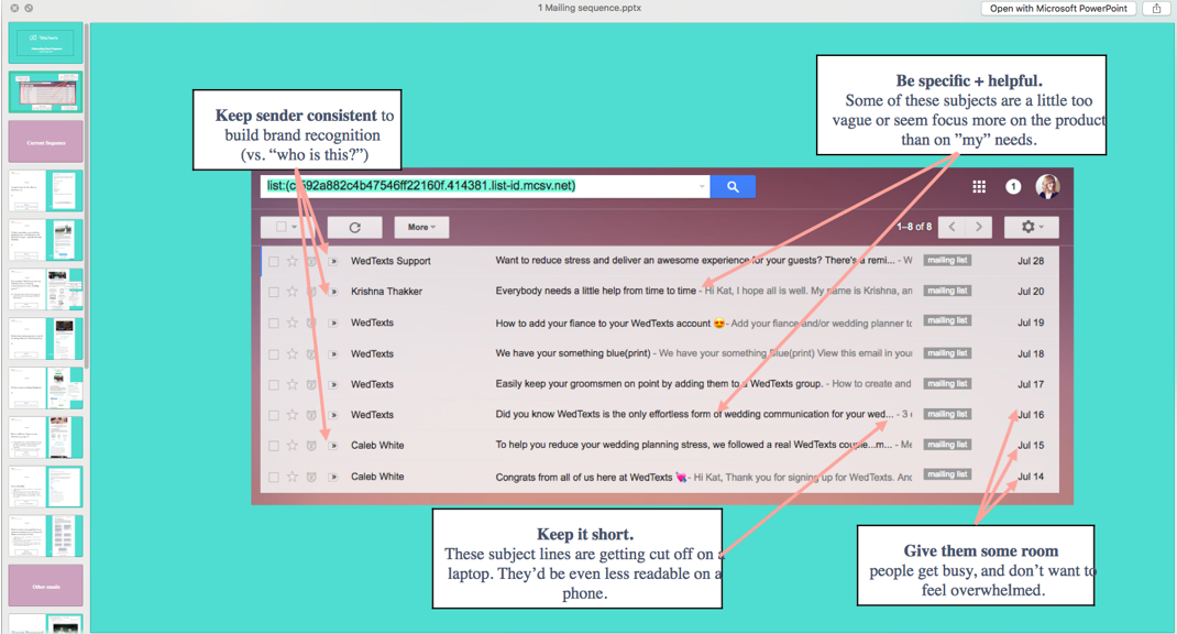
The secondary call to action on the homepage (after “trial”) was to sign up for newsletter. As is common practice, an email sequence was being used to increase brand awareness and initiate engagement with potential users.
This is a snapshot of the initial sequence being sent, with recommendations to improve conversions.
Key recommendations from the audit were:
(a) Increase consistency – especially with regards to sender’s name, to facilitate building trust
(b) Have more empathy for users’ lifestyle – giving people more time between mailings to process information and help improve recall
(c) Focus on helpfulness instead of “mail for mail’s sake” – having a clear value and action for each email being sent
Although not part of the original design sprint, I thought that Wedtexts’ visual brand might be impacting how well the app resonated with its target audience: young women about to get married. The visual brand used the commonplace blues seen in stodgy corporate identities paired with routine typography.
A wedding should feel anything but stodgy and routine. I updated the brand’s colors to be brighter and more fun, including pink hues as a nod to the femininity of the brides-to-be. I also updated the logo with a more modern text treatment and thicker lines for readability. Finally, I recommended an update to the brand’s typography to hint at the gorgeous lettering weddings invitations are known for, while still leaving the overall feel very modern so that it fit a tech product.
I updated the visual design of the emails to improve readability, used the new styling designed to resonate with Wedtexts’ target audience, and gave a more modern and professional impression overall. I also created templates in Mailchimp so that the team could use the format consistently in the future.
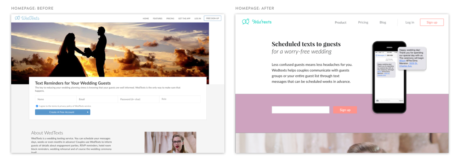
I simplified the primary navigation to reduce the number of options a user needed to consider. Messaging about the trial being free and a link to the App Store were both prominent on the home (product) page, so these were removed. I also updated the titles for a consistent tone.
In addition, I updated the overall styling of the UI to match Wedtexts’ new visual brand, giving the site a more modern and polished feel. Finally, I organized the secondary links located in the footer by category to improve findability.
A comparison of Wedtexts’ site from before and after the design sprint.
Deliverables
UX / STRATEGY
Guest post content strategy
Referral program architecture
UX copy edits (web, email)
Mailing sequence content strategy
UI / VISUAL
Brand update
UI elements
Web mockups (homepage, dashboard)
Email redesign
Presentation template
DEVELOPMENT
All credit goes to Wedtexts for final implementation! (Ney for dev + Caleb for marketing, details above)
Impact
When starting, Wedtexts was having trouble resonating with its target audience. While they were getting traffic to their site, it wasn't resulting in conversion.
THE DESIGN SPRINT RESULTS:
Homepage that converted 300% more purchases than over previous period (“Place an order”)
Increased user retention of those who had a trial or subscription, the website showed 00% more account usage than over previous period (“Create Wedding”)
Visual design that resonates with users with an updated brand and UI system across web, email, and mobile app.

“I loved the thoughtfulness and creativity of working with Kat. She is able to quickly grasp new and different concepts, create amazing digital assets, and tie everything back to measurable business goals.”


