
CLIENT
Wedtexts
Wedtexts is as a SaaS app helping couples communicate with wedding guests through text messages that can be scheduled weeks in advance. While they were getting a fair amount of traffic to their page, they needed help converting that audience into users. In addition, they were launching a mobile app that needed to create the same easy experience their users were familiar with on their website.
Branding / UI Design / Usability / Content Strategy
TEAM
Kat Ingalls, Glitchcraft
Design – UX, Visual
Caleb White, Wedtexts
Hustle – Writing, Promotion
Nay Tun Thein, Wedtexts
Development – Web, Mobile
TOOLKIT
Strategy
Google Analytics (site/app audit), PowerPoint (user journey), Google Docs (UX copy)
Design
Adobe Illustrator (logo/brand elements), Sketch (web mockups)
Development
Mailchimp (template + scheduling)
Challenge
Opportunities Identified
A homepage that converted the traffic that they were already receiving into paid users
A user journey that managed leads in a way that focused more on helpfulness and less on sales messaging
More paying customers to take the business from barely-in-the-black to profitable and sustainable
Design Process


Impact
When starting, Wedtexts was having trouble resonating with its target audience. While they were getting traffic to their site, it wasn't resulting in conversion.
THE FINISHED PROJECT:
Homepage that converted 300% more purchases than over previous period (“Place an order”)
Increased user retention for trials and subscriptions, with a 600% increase in app usage (“Create Wedding”) over previous period
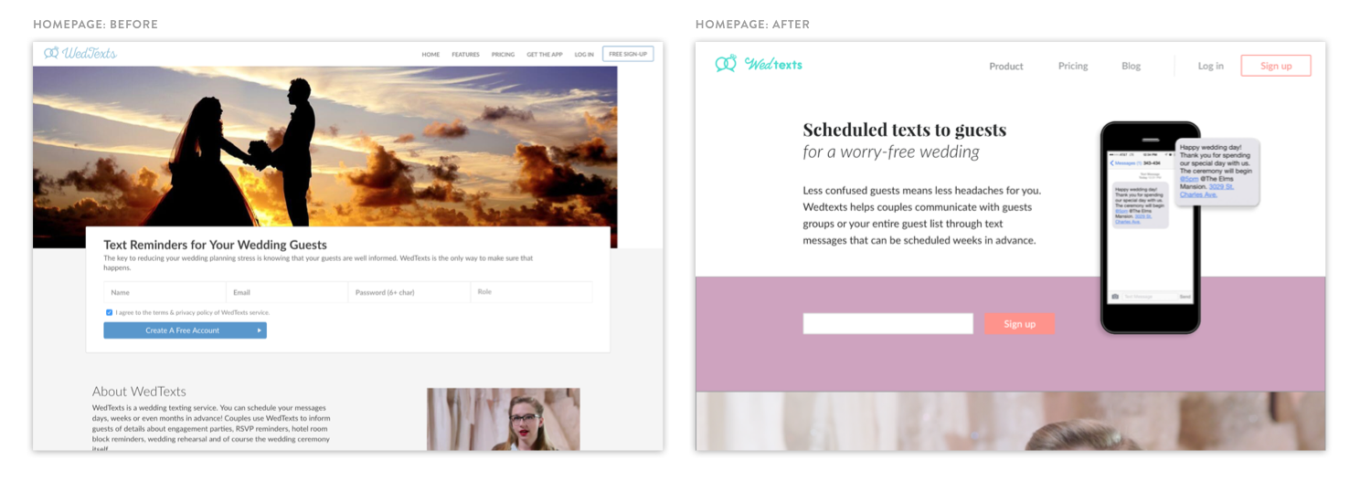
Visual design that resonates with users with an updated brand and UI system across web, email, and mobile app.

Deliverables
STRATEGY
Guest post content strategy
Referral program architecture
UX copy edits (web, email)
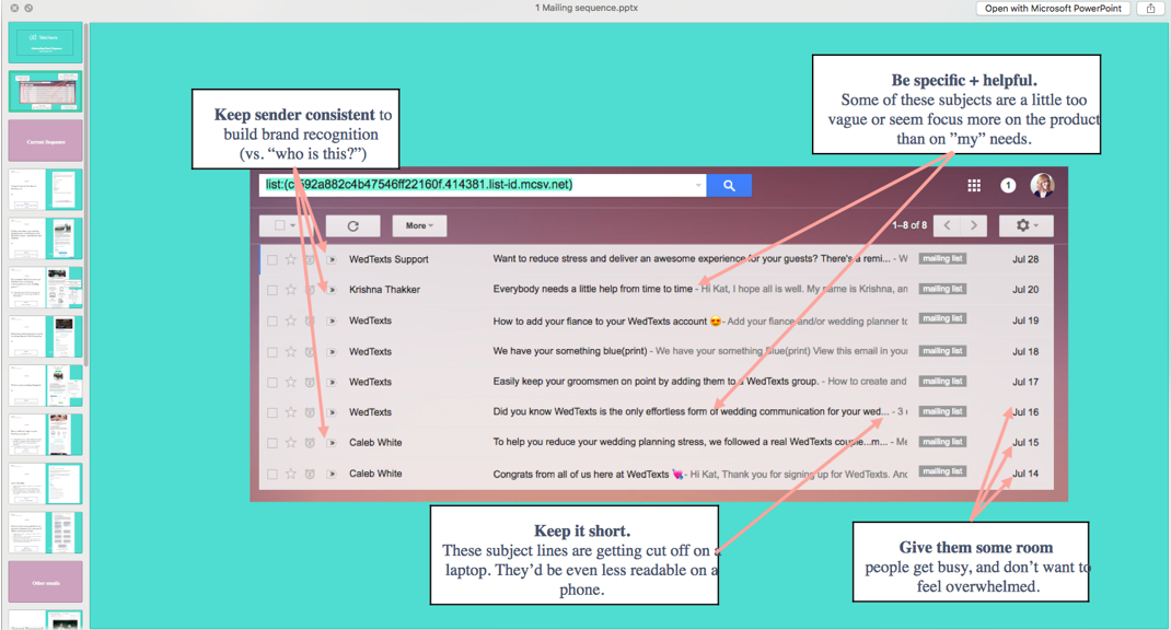
Mailing sequence content strategy
DESIGN
Brand update
UI elements
Web mockups (homepage, dashboard)
Email redesign
Presentation template
DEVELOPMENT
All credit goes to Wedtexts for final implementation! (Ney for dev + Caleb for marketing, details above)
“I loved the thoughtfulness and creativity of working with Kat. She is able to quickly grasp new and different concepts, create amazing digital assets, and tie everything back to measurable business goals.”