colorful Wedtexts - darkpurple-device.png

Wedtexts

affiliate program, digital strategy, guest posts, impact, mobile app, onboarding, sales funnel, solution, web

CLIENT

Wedtexts

Wedtexts is as a SaaS app helping couples communicate with wedding guests through text messages that can be scheduled weeks in advance. While they were getting a fair amount of traffic to their page, they needed help converting that audience into users. In addition, they were launching a mobile app that needed to create the same easy experience their users were familiar with on their website. 

Branding / UI Design / Usability / Content Strategy

TEAM

Kat Ingalls, Glitchcraft
Design – UX, Visual

Caleb White, Wedtexts
Hustle – Writing, Promotion

Nay Tun Thein, Wedtexts
Development – Web, Mobile

TOOLKIT

Strategy
Google Analytics (site/app audit), PowerPoint (user journey), Google Docs (UX copy)

Design
Adobe Illustrator (logo/brand elements), Sketch (web mockups)

Development
Mailchimp (template + scheduling)


Challenge

Opportunities Identified

  1. A homepage that converted the traffic that they were already receiving into paid users

  2. A user journey that managed leads in a way that focused more on helpfulness and less on sales messaging

  3. More paying customers to take the business from barely-in-the-black to profitable and sustainable


Design Process

Product Onboarding: Before

Product Onboarding: Before

The amount of information displayed after a user signed up for a Wedtexts trial is overwhelming. The amount of text is intimidating and the number of (steps? options?) are likely to cause confusion rather than action.

Adding some strong skimmable titles, separating “option” from “step” information (ex. upgrade vs group), adding some imagery, and including action-oriented buttons would help make this initial impression more friendly and actionable.

Product Onboarding: Redesign

Product Onboarding: Redesign

The information displayed on the first screen after signing up for a trial or subscription was minimized to reduce overwhelm and focused on being immediately actionable.

“Steps” have been separated into just two options: (a) Start from scratch or (b) Let us give you a blueprint. The “options” from the previous onboarding screen have been moved into the sidebar – with the new addition of “Refer a friend” to support the new referral program. Options to upgrade have been moved under “Account” (best for active subscribers) as well as a banner at the top of screen. For trial users, this is an obvious reminder about the lack of some features.

Finally, the sidebar architecture has been cleaned up, with a clearer hierarchy for navigating the different features of Wedtexts’ product.

Home Page Redesign

Home Page Redesign

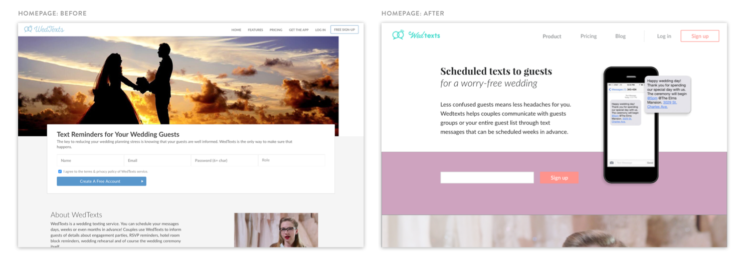
A comparison of Wedtexts’ site from before and after the design sprint.