colorful colonial - darkpurple-device.png

Colonial Life Policy Retention

test

Making complex product options from an intimidating industry easier to understand

Colonial Life

Colonial Life is a supplementary insurance company whose primary business is through employers. One of the strengths of its insurance policies is its highly-personalized product options. However, the number of different product configurations and potential use cases makes translating their customer experience to a digital platform exceptionally complex.

Information Architecture / UX Strategy / UI Design / Content Strategy

TEAM

Kat Ingalls / Lead UX Designer

Heather Allison / Product Owner
Tenille Simmons / Business Analyst
Stephonie Sturkie / Scrum Master

Kyle Southerland / Frontend Developer
Allen Pugh /
Backend Developer
Robert Harrelson / Mainframe Developer
Jithesh Ramachandran /
Mainframe Developer
Jane Huo / Test Engineer


Challenge

The amount of time employees stay with a company has decreased over the years. While Colonial Life’s traditional business was still performing well, the opportunity for conserving employees’ policies after leaving an employer is enormous. Many employees were not aware they could keep their policies after leaving an employer. And the existing experience of keeping coverage was not high-performing.

Colonial Life needed a solution to:

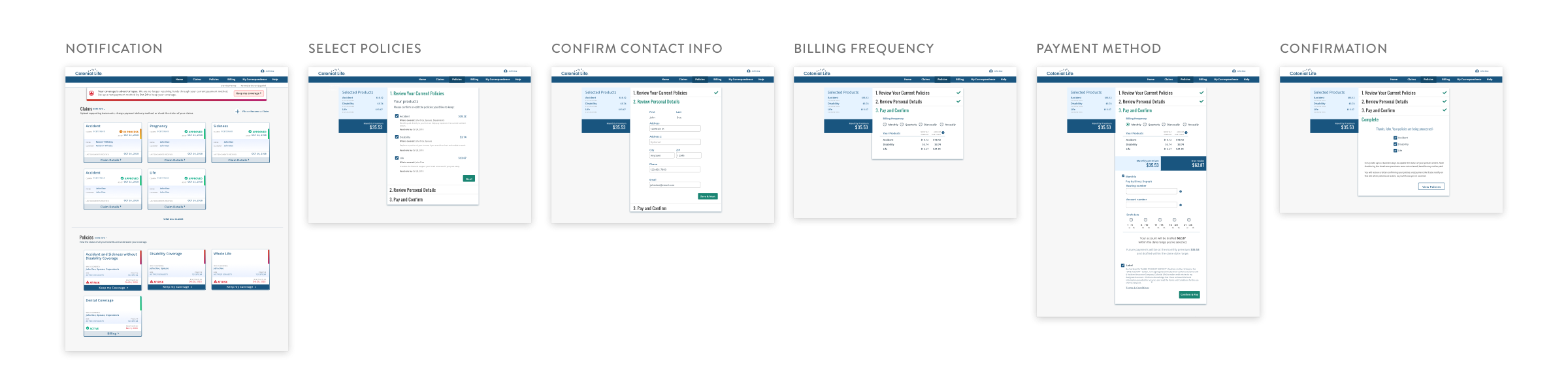
  1. Notify users (policy holders) to a change in their policy status

  2. Increase conversion from employer-billed benefits to individual-billed benefits


Process

0 design process.png
Existing Experience

Existing Experience

The existing experience mailed a letter to policy owners whose coverage was about to lapse, with the option to “Continue this Valuable Coverage”. The letter doesn’t explain why your policy was about to lapse, or why it might be considered ‘valuable.’

While mail can be a great partner to digital experiences, the letter template being used was came across as impersonal, salesy, and dated. Not exactly inspiring trust – the association you’d like to have as an insurance provider.

Existing User Flow

Existing User Flow

Our in-house specialists learned that people often thought this letter was junk mail or they misplaced it. While the policyholder website did have a form to make a payment, the link was only listed under ‘Billing,’ the site had no indicator of which policies were available to conserve, and policyholders were not being notified electronically at all.

Architecture

Architecture

Task Analysis

Before mapping out a solution, we needed to identify the steps required for a user to complete the goal (keeping their coverage). I did an exercise combining task analysis and requirements definition. The overall flow of the existing experience was kept:

[Receive notification → Review Policies → Select Policies → Update Payment Method]

Organizational Structure

I recommended adding the ability to “View Coverage Details” to the existing flow to address the problem of users not understanding what their policy covered. For this feature, we needed a clear definition of what would make a helpful policy overview. For that, I mapped out what policy details were accessible online.

Requirements Definition

Requirements Definition

Based on the research done, I was able to more accurately identify and communicate the problem the team needed to address for this project. While the business objective was clear from the start, the use cases and user requirements hadn’t been identified. I also made sure the business goals were measurable by attaching KPIs to each objective.

Task Flow Recommendation

Task Flow Recommendation

I wanted to keep the familiarity of the traditional (paper) task flow, while improving on the problems identified in that experience. It needed to be Straightforward: Insurance is complicated enough; make this process as step-by-step as possible. It needed to have Context: Explain why this is happening, and why it matters to me. And the flow needed to be Individualized but uncomplicated: The ability to adapt to someone’s circumstances is one of Colonial’s differentiators, and we wanted that flexibility to carry over without overwhelming the user with options.

Initial Concepts

Initial Concepts

NOTIFICATION
To address the problem of people losing the paper letter, I recommended sending an email notification. This could either supplement the existing letter, or if a user had opted in to paperless messaging, be email-only. This would save on mailing costs, reduce environmental impact, and cater to an increasingly digital-first generation.

REVIEW POLICIES
The policyholder would then be taken to a ‘wizard’ style process, where they’d be shown the policies that were eligible for keeping – with everything they’d need to make a decision shown in one view: details on what benefits those policies offer, who was covered, how much it’d cost, and the date action needed to be taken by.

CONFIRM CONTACT INFO
Since this use case is primarily triggered when someone leaves their job, the policyholder may be going through a move. Asking to confirm their contact information (a) reduces mailing errors and (b) is a perfect point to ask their preference on receiving notifications – both problems that were identified during research.

PAYMENT OPTIONS
Updating the previous PDF payment form to an inline input removes opportunities for confusion (generic form) and is easier for the user. By supporting a more seamless and modern experience, it also helps Colonial to be seen as supportive and reliable.

CONFIRMATION
Both the paper version of this experience and the digital PDF didn’t provide confirmation. If the policy showed up on your next (mailed) billing statement, then it worked. If you’re going to ask someone for their payment details, it’s important to assure them that everything went as expected. Again: trustworthiness. No one likes wondering and worrying if something was done. Adding a confirmation screen mitigates that anxiety (and reduces support call volume as well!).

Policy Card Concepts

Policy Card Concepts

The existing website displayed policy cards on the dashboard. To make it clear which policies were at risk of lapsing, I updated the data shown on policy cards.

BEFORE
The status shown on the existing cards were hard to differentiate (i.e. Active vs Inactive). The details shown were business-centric and included ‘BCN’ (a type of group number) and Policy Number: things a user might reference, but those details don’t mean anything to them and weren’t what they really cared about seeing. Finally, the existing policy cards were static / unactionable, but were styled similarly to claims cards that are clickable.

REDESIGN
I updated the policy cards to focus on information more relevant to a policyholder, while still including account numbers for reference. To increase skimmability I added a visual icon representing the policy type and introduced color coding for the policy’s status. To communicate policy benefits better, I added a short description of the policy type and listed the people covered. Finally, I distinguished between actionable and non-actionable status types with a clear CTA area.

Product Name Locations

Product Name Locations

TESTING
While reviewing the design concepts, the team identified a discrepancy in how policies are named. Depending on where the data was stored on the mainframe, the same policy could have two different titles.

PROBLEM
The current policy cards were pulling from a service that referenced a longer name that was a carryover from enrollment. These sometimes included the policy product name, but sometimes referenced ‘pseudo-products’ (riders), like “Sickness Coverage.” However, the service being built to determine which policies were at risk of lapsing, was able to display to the short product names used in user-facing communications.

DECISION
While we could have used the longer policy card titles within the wizard being designed for consistency, the team agreed that using the shorter names was more user-friendly and the ideal solution moving forward. Instead of creating design debt at the expense of consistency, we used the short product names throughout the wizard, and added a feature request to update the policy card service in the future.

Policy Tile Categories

Policy Tile Categories

A detail view of the different policy statuses and their styling specs. Developing a service that mapped the existing policy names to the short product titles displayed in the concepts was out of scope for this project. The design of the policy cards was updated based on this constraint.

Alert Styling and Refinement

Alert Styling and Refinement

The original alerts were styled based on existing but outdated brand guidelines. Colonial is in the process of defining and developing a design system and, understandably, it’s taking awhile to define.

While testing mockups, feedback was that current the alert was overwhelming and “just too much [color]” – especially in the context of the new color-coded policy statuses.

I updated the styling of the alert based on feedback and where our design guidelines are heading, keeping in close sync with other designers defining those standards. The specific style may still change, so I worked with devs to make sure styling is modular and system-based so that any future adjustments are super easy to make.

Claims Cards: UI Update

Claims Cards: UI Update

The existing dashboard displayed an overview of claims and policies in the form of status cards. For this project, I updated the style of the policy cards to better communicate current status – ‘at risk’ being a new status type. They looked fantastic when shown alone on the new policy page. But when shown alongside claims cards on the dashboard, it made the claims look very dated in comparison.

I’d hoped to eventually update the claims cards, but originally it was out of scope of the project. Happily, during a design review, business stakeholders actually asked to update the claims cards. This was a huge win for UX, helping us catch up on some design debt.

Dashboard Comparison

Dashboard Comparison

Making sure “At Risk” policies were easily differentiated from other policy cards required a redesign of the existing policy cards, and the addition of a new “Policy” page. While updating the dashboard wasn’t a focus of this project, it ended up being a great side effect. The new landing page is much more readable, looks more professional, and is designed to support future functionality.

Solution

Solution

NOTIFICATION
If a user has a policy at risk, they’ll see an alert immediately when logging in to the website. The letter sent currently directs policyholders to the web, and now the site will finally support this use case.

SELECT POLICIES
Clicking on the alert or an ‘At Risk’ policy will take the user to the Conservation Wizard, which walks them step-by-step through the process of keeping their coverage. This first step shows all the information needed to decide whether or not to keep a policy: What the benefits are, Who is covered, and How much it costs.

CONFIRM CONTACT INFO
An “At Risk” policy usually occurs when someone leaves their job, and this might include a move. Asking to confirm their contact information reduces mailing errors, a problem identified during research.

BILLING FREQUENCY + PAYMENT METHOD
Compared to the original digital PDF form, it’s now much easier for a user to understand their options and enter the required information. Monthly premiums are shown persistently in the sidebar to reassure the user that, regardless of billing frequency, the monthly premium shown in step one hasn’t changed. And errors are addressed instantly rather than reactively.

CONFIRMATION
Both the paper version of this experience and the digital PDF didn’t provide confirmation. This screen reassures the user that they did everything correctly (and reduces support call volume as well!).

Mockup Detail

Mockup Detail

Detail view of final mobile and desktop designs.